Webinars
From Canvas to Code: Responsive Web Design Strategies (Webinar Replay)
Aug
Does Your Visual Design Fall Apart the Moment It Hits Code?
In modern digital design, static mockups rarely survive the transition to real screens. We’ve all been there: what looks balanced, high-impact, and perfectly spaced on a 1440px desktop frame in Figma often turns into broken typography, misplaced focal points, and compromised branding on tablet, mobile, or ultra-wide displays.
If you’re struggling with broken layouts, inconsistent brand typography across breakpoints, and inefficient developer handoffs, you are not alone.
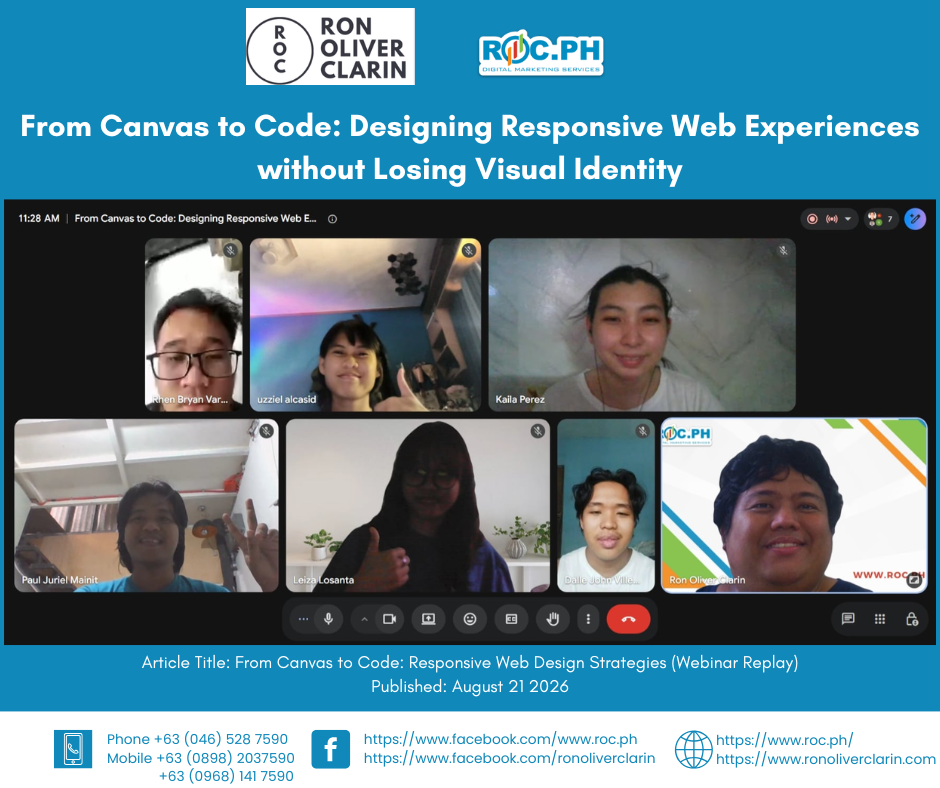
Earlier today (August 21, 2026), ROC.PH hosted an in-depth, live masterclass: From Canvas to Code: Designing Responsive Web Experiences without Losing Visual Identity.
Due to popular demand, we are making the full, uncut recording available for those who missed the live Google Meet session!
What You Missed: Bridging the Gap Between Figma and the Browser
Great web design isn’t fixed to a single screen—it flows effortlessly into any medium without losing its soul. During this one-hour intensive session, we explored how to design with browser mechanics in mind.
Here are the core frameworks and practical strategies covered in the recorded session:
1. Mental Models for Modern Web Layouts
Stop thinking in fixed pixels. Learn how to design using responsive containers, auto-layout logic, and dynamic viewport units (`vw`, `vh`, `rem`, `ch`) to create layouts that breathe and adapt naturally.
2. Fluid Typography & Adaptive Spacing Systems
Say goodbye to dozens of media query overrides! We dive into clamp-based fluid scales (`clamp()`) that allow your typography and spacing to smoothly and automatically adapt across any screen size.
3. Preserving Brand Character Across Breakpoints
How do you keep your art direction and decorative elements intact on mobile? We share techniques to ensure your brand’s balance and aesthetic vision remain uncompromised, whether on a smartphone or an ultra-wide monitor.
4. Figma to Code: Frictionless Developer Handoff
Set your engineering team up for success. Learn how to configure design tokens, auto-layout properties, and responsive specs in Figma that translate directly and seamlessly into clean CSS or Tailwind.
5. Responsive Component Architecture & Asset Optimization
We break down how to design modular navigation bars, content grids, and interactive cards. Plus, we cover critical performance optimization techniques—exporting vector assets, implementing responsive images (`srcset`), and using modern web formats like WebP and AVIF to maintain visual fidelity without sacrificing page speed.
Who Will Benefit from This Course?
- UI/UX & Product Designers: looking to master fluid design systems and frontend constraints.
- Frontend & Web Developers: who want to better interpret and implement complex visual layouts.
- Graphic & Brand Designers: transitioning from print/static media into digital web design.
- No-Code & Webflow Builders: building custom, highly responsive websites for clients.
Access the Full Webinar Recording Today!
Ready to stop guessing your breakpoints and start building truly responsive, scalable, and performant web experiences?
You can now avail of our Online Full Access, which includes the complete e-recording of the masterclass along with an official e-Certificate of Completion to add to your professional credentials.
👉 Get Full Access to the Recording Here
https://roc.ph/service/canvas-to-code-responsive-web-design
Looking for more training? Check out our Upcoming Webinars (https://roc.ph/webinars) and browse our library of Recorded Webinars (https://www.roc.ph/courses).
